A Color Lover’s Take on Pantone’s Colors of 2021
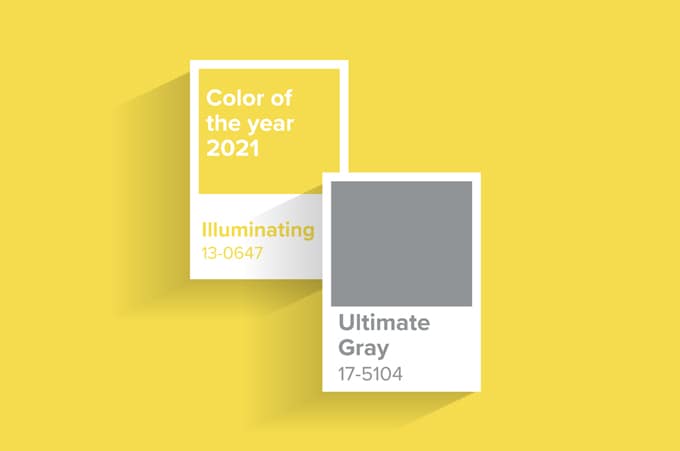
Photo Courtesy of Flux Magazine
Every color lover paid special attention to December 9, 2020. With the pandemic almost at its peak, casting a deep shadow over the forthcoming holidays, these color lovers needed some good news. For many, excitement came with Pantone’s announcement of, not one, but two colors of 2021: Ultimate Gray and Illuminating.
Pantone’s choice is part of an annual, twenty-two-year-long tradition to select a color (or two!) to represent the upcoming year. When each December rolls around, Pantone analyzes color trends in fashion, graphic design, interior design, architecture and more to foreshadow the direction of the color world. For 2021, this world appears neutral gray and sunshine yellow.
Although Pantone’s “Color of the Year” is relatively established, this year brings some marked differences from the past. Primarily, this year is the first time any gray has earned a seat at the color table. Previously, Pantone has often opted for brighter, bolder hues—take 2019’s Living Coral or 2012’s Tango. Pantone has also dabbled in muted colors, pastels, earthy tones, etc., but never gray. Arguably, gray does not even meet the criteria for “Color of the Year,” as most grays are technically shades composed only of black and white. Nevertheless, here we are in 2021.
Another significant change is that extra “s” in “Colors.” Since the “Color of the Year” tradition began, only one other year gave us two colors at once—2016’s Rose Quartz and Serenity. Those two colors, however, were remarkably similar and meant to fade into one another. Ultimate Gray and Illuminating, conversely, are designed to stand alone, together. As Leatrice Eiseman, executive director of the Pantone Color Institute, shared, the gray and yellow are “two independent colors really coming together.” So let’s get into each color independently, first.
Ultimate Gray might best be described as very, very gray. Neither light or dark and stormy, Ultimate Gray is “ultimate” because of its Goldilocks stance between white and black. Eisemen describes the shade as “dependable,” and the Pantone website highlights it as “practical and rock solid.” The appeal of such a stable shade for 2021 is not rocket science: it is the return to normalcy, and perhaps even dullness, that this “unprecedented” and unbelievable year has left us desiring. It is the calmness of pebbles on a quiet beach, the reliability of gray sweatpants that no one in my Zoom class can see me wearing. Yet, gray also reflects the ambiguous and uncertain, dimming our sights like foggy weather. This year, of course, the unknown is no stranger to any of us.
The second color, Illuminating, is a light yellow, resembling sweet lemonade or early sunshine. This is the second year Pantone has ever selected a yellow, the first being Mimosa in 2009. Although Mimosa was darker with more tints of orange, the similar message is clear—hope on the outskirts of economic downfalls or worldwide infections. When choosing Illuminating, Pantone reasoned: “we need to feel that everything is going to get brighter—this is essential to the human spirit.” Illuminating, which Pantone describes as “a warming yellow shade imbued with solar power,” might offer this optimism and joy for the future.
Though Illuminating and Ultimate Gray are starkly different, Pantone intentionally paired them together. As a result, color lovers have speculated on the rationale behind this decision. Kyle Chakya of ARTnews, for instance, believes the color pairing is reminiscent of Maurizio Cattelan’s viral sculpture of a banana stuck on the wall with duct tape from 2019. If this is the case, perhaps the colors speak to a pre-COVID life to offer some nostalgia or reassurance. Personally, however, that seems like a stretch. I think these colors are more likely a representation of this moment. UCLA economists currently predict “a gloomy COVID winter and an exuberant vaccine spring,” so perhaps Ultimate Gray reflects the winter and Illuminating the spring? With this in mind, the color combo offers an admission of reality combined with a light at the end of the tunnel.
Despite Pantone’s hard work to pick colors that represent the year, not everyone approved of their choices. Prominent interior designer Orlando Soria expressed his disappointment at seeing the gray-toned news, as he feels mid-tone grays are “dead and dull.” Other color fanatics, such as myself, were simply surprised. Everywhere one looked, all signs pointed to brown as 2021’s color. Trending fashion brands are putting out brown clothes and accessories as if brown is the only pigment they can produce, and graphic/interior designers are increasingly turning towards earthy/muted colors. Furthermore, many onlookers noted that brown could have referenced the Black Lives Matter movement and celebrated brown skin tones in the wake of racial injustice. Left without answers, color lovers can only wonder what those decisive Zoom discussions might have looked like, and what led other colors to be ruled out.
Even though Pantone’s news may have been disappointing or unexpected for some, it will nevertheless impact design trends to come. While Pantone uses existing color currents to make their decision, the company holds a large amount of power in their own right. Many brands or businesses trust Pantone’s clairvoyant ability to forecast which colors to use for maximum attention and success. If Pantone is right, you will be seeing a lot more of Ultimate Gray and Illuminating, whether broadcasted in commercials or hidden in unexpected places. Hopefully, knowing the stories behind these colors will add a layer of intention and complexity, so that you too can become a color lover in 2021.